In the text presentation tutorial, we saw how font metrics for the built-in Tiresias font can vary between implementations, and how this can affect text layout if an application uses a text layout manager. The images below are larger versions of the ones from the main page, showing in a little more detail how the layout is affected.
In the text presentation tutorial, we saw how font metrics for the built-in Tiresias font can vary between implementations, and how this can affect text layout if an application uses a text layout manager. The images below are larger versions of the ones from the main page, showing in a little more detail how the layout is affected.
Examples of how different metrics for built-in fonts can affect text layout with text layout managers (images courtesy of Televisio de Catalunya)
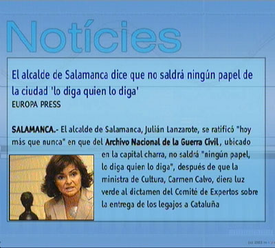
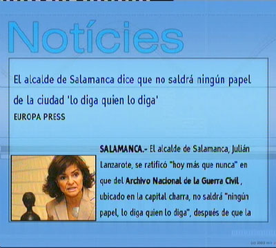
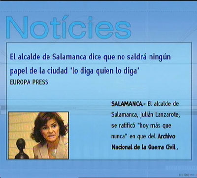
As you can see from the example below (taken from the same implementations as the examples in the text layout tutorial), this can have a more dramatic effect when using a text layout manager to format text in fairly tight spaces, such as a table.
More examples of how different metrics for built-in fonts can affect text layout with text layout managers (images courtesy of Televisio de Catalunya)
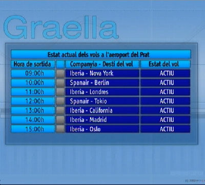
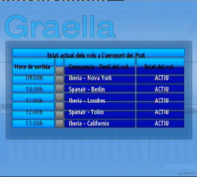
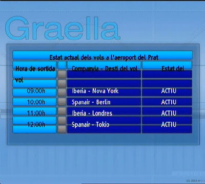
The relevant font metrics for the platforms used in these examples are given in the table below for comparison:
| Font size | Max. width | Max. height | |
|---|---|---|---|
| Implementation 1 | 24 | 20 | 32 |
| 31 | 26 | 42 | |
| Implementation 2 | 24 | 21 | 41 |
| 31 | 28 | 53 | |
| Implementation 3 | 24 | 174 | 38 |
| 31 | 226 | 50 |
For downloaded PFR fonts, the maximum widths and heights were usually very close (but not identical) across all platforms.
While some of these problems are resolved in the second set of errata to tthe MHP 1.0.3 specification, and more will be solved by future versions of the test suites, developers should bear in mind these issues when using text layout managers.
